You unlock your iPhone at the bus stop, a Messages banner slides down over a bright morning-sky wallpaper, and the words seem to dissolve into the photo.
A pale gradient or a beach shot sits behind the notification and the text half-vanishes into the frosted panel on top.
This is not a glitch, and you are not squinting wrong.
iOS 26 brought a design called Liquid Glass, and one writer at MakeUseOf put it bluntly: "A light wallpaper in the background is all it takes for text to start melting into it."
This guide fixes the readability, lightest touch first. Most people land on one of the first two changes and stop there.
What Liquid Glass actually is
Apple rebuilt the look of iOS 26 around a translucent, refracted-glass material. It sits on nav bars, buttons, notification banners, Control Center, and the Lock Screen clock.
That glass uses your wallpaper as its surface, so background colors bleed through in a blurred, shifted form. When the wallpaper is bright, contrast drops and text gets thin and faint.
Worth being clear: this is a design decision, not a bug.
As Fone.tips notes, "There is no master off switch in Settings." Apple kept Liquid Glass as the baseline and added settings to dial down its intensity, not remove it.
So the fix is in Settings. You are reducing the effect, not deleting it.
Switch Liquid Glass to Tinted (iOS 26.1 and later)
If your iPhone is on iOS 26.1 or newer, start here. Apple added a dedicated control after hearing, in its words, that users would "like a setting to manage the opaqueness of the Liquid Glass design."
Go to Settings > Display & Brightness > Liquid Glass and choose Tinted instead of Clear. Apple describes Tinted as adding "more contrast and increased opacity."
In Light mode it places a light, opaque panel behind notifications and swaps white text for black.
One Apple Community user summed up the relief: their notifications "finally changed from black with white text back to white with black text."
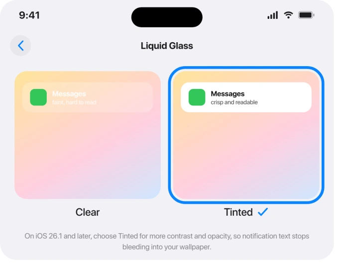
One catch to know going in. The Clear/Tinted control is greyed out unless Reduce Transparency and Increase Contrast (both in Accessibility) are turned OFF first.
Apple confirms this directly: you "need to turn them off to change the look for Liquid Glass."
So it is one route or the other. Tinted is the lighter-touch path that keeps a little glass; the Accessibility toggles below are the heavier hammer.
Be aware of what Tinted does not touch. It mainly helps Lock Screen notifications and in-app menu and navigation bars. MacRumors notes "little to no change" for Control Center, the App Library, app icons, and widgets.
Change your wallpaper
Because the glass borrows color from whatever is behind it, your wallpaper is doing more work than you think. A bright, busy photo is the worst case.
Set a dark, plain, static wallpaper and a lot of the problem evaporates.
As 3Zebras puts it, "Dark, low-contrast wallpapers produce the subtlest Liquid Glass effect," while bright ones look "chaotic when it doesn't" work.
Long-press the Lock Screen, tap Customize, or go to Settings > Wallpaper > Add New Wallpaper, and pick a solid dark color or a simple gradient.
One reader switched from a beach photo to plain dark gray "and it made all the difference."
This pairs well with Tinted, and it costs you nothing in terms of the glass look elsewhere.
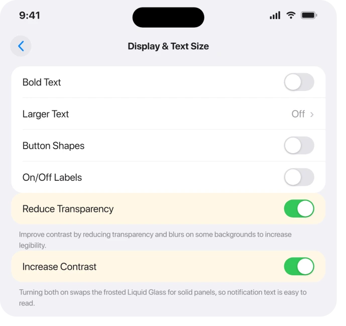
Reduce Transparency: the strongest single toggle
If you want notifications to genuinely pop, this is the heaviest lever. Go to Settings > Accessibility > Display & Text Size > Reduce Transparency and turn it ON.
Apple's own display and text settings guide says it "improves contrast by reducing transparency and blurs on some backgrounds."
In practice, Control Center, Notification Center, and the app switcher swap their glass for solid opaque panels.
One user on Mochi's Lab described the moment vividly: "After turning on Reduce Transparency, my notifications popped off the screen again. It was instant."
The trade-off is real. This changes the look system-wide, not just notifications, and it strips most of the glass aesthetic.
On the Lock Screen it fills notifications with a dark overlay whose color you cannot change, so it can feel like permanent dark mode there.
It also overrides the Tinted control, which is why the two cannot stack. Pick the one that bothers you less.
Increase Contrast for sharper edges
Use this alongside Reduce Transparency when you want maximum legibility. Go to Settings > Accessibility > Display & Text Size > Increase Contrast and turn it ON.
Apple says it "improves color contrast between app foreground and background colors." It also thickens borders and adds a more defined outline around icons, the Lock Screen time, and notifications.
Enabling both Reduce Transparency and Increase Contrast together makes panels lose almost all their translucency. That is the cleanest, most readable result, and also the furthest from the original glass look.
Bold Text for heavier letters
A quiet helper that does not touch the glass at all. Go to Settings > Accessibility > Display & Text Size > Bold Text and turn it ON.
It renders system fonts heavier everywhere, including Lock Screen and notification text, so thin letters stop fading into busy backgrounds. In iOS 26 it applies instantly with no restart.
Dark Mode to calm the glow
Dark Mode does not disable Liquid Glass, but it calms it. Darker panels mean white text reads more cleanly and the bright glow of translucent surfaces drops.
On OLED screens it also eases iOS 26 battery drain.
Go to Settings > Display & Brightness > Appearance and tap Dark, or open Control Center, press and hold the brightness bar, and choose Dark Mode.
Apple's Dark Mode page also covers an Automatic option that switches on a schedule.
One nuance: critics felt Tinted notifications look better in Dark mode than Light.
In Light mode, John Gruber called them "orthopedic, like an extra-high-contrast accessibility option," so Dark Mode can soften that blocky look.
Reduce Motion for the wobble, not the blur
If what bothers you is the rippling, lensing animation when you swipe to unlock rather than the contrast itself, this is your toggle. Go to Settings > Accessibility > Motion > Reduce Motion and turn it ON.
It removes the liquid distortion and parallax effects without changing the glass appearance. Some users combined it with Reduce Transparency specifically to cut eye strain and queasiness.
If you are on a newer point release
Apple kept tuning this.
On iOS 26.2, the Lock Screen clock got its own control: long-press the wallpaper, tap Customize, tap the clock, and choose Glass or Solid, with a slider for how transparent the clock numbers are.
iOS 26.2 also added a screen-flash-on-notification option, briefly flashing the display at full brightness when an alert arrives, which helps if you keep missing faint banners.
If they never arrive at all, Focus may be silencing them.
One quirk some users report: with dynamic or Spatial Scene wallpapers, the clock slider may reset itself on unlock. If you hit that, set a static photo before adjusting it.
What this cannot fix
Even maxed out, this is reduction, not removal. An Apple Community moderator was blunt with users hoping for a fix: "There is no fix. It is operating as intended."
Some surfaces stay stubborn. Reduce Transparency helps system-wide, but specific in-app spots, like notes in Contacts, can still read white-on-light in places.
And accessibility advocates flagged real harm: AppleVis said Liquid Glass "had a significant negative impact on the user experience for many" low-vision users.
If you tried everything and still find it worse than iOS 18, that reaction is legitimate, not stubbornness.
The Short Version
- On iOS 26.1 or later, set Settings > Display & Brightness > Liquid Glass > Tinted first. Lightest fix, keeps some glass.
- Switch to a dark, plain, static wallpaper. The brighter your wallpaper, the worse the glass reads.
- For the strongest result, turn ON Settings > Accessibility > Display & Text Size > Reduce Transparency (and Increase Contrast). This overrides Tinted, so you pick one route.
- Add Bold Text and Dark Mode for extra legibility; add Reduce Motion if the animation bothers you.
- Tinted mostly fixes Lock Screen notifications and in-app bars; Control Center needs Reduce Transparency.
- There is no full off switch. This is a design choice, so the cure is settings, and some people still prefer iOS 18.
Where to Next
- More iOS 26 fixes: iOS 26 problems and fixes
- Back to the start: pcglance home

Isaac Smith is the founder and editor of PC Glance, a website that covers computers, laptops, and technology. He is a tech enthusiast and a computer geek who loves to share his insights and help his readers make smart choices when buying tech gadgets or laptops. He is always curious and updated about the latest tech trends.