Impact isn't automatically available in every Chromebook app just because it appears on a Windows computer. For Google Docs, check More fonts first; downloading an Impact font file doesn't add it to Docs' font menu.
The right solution depends on whether you need the exact Impact typeface or just a bold, narrow heading. A similar font can solve the second problem, while an exact match needs an app that supports Impact and a properly licensed copy.
In this guide
Check which app is missing the font
Open the file and identify the editor you're using. Google Docs in Chrome, an Android writing app and a Linux desktop editor each manage fonts differently. There isn't one Chromebook font installation menu that serves all three.
Microsoft lists Impact.ttf as the font file and includes Windows among the products that supply Impact. That explains the difference from your Chromebook's list.
An imported document can show Impact in its font settings even while displaying a substitute. That font name alone doesn't mean your editor can use it to display or create text.
Compare a short heading with the original document, especially its line breaks and spacing. If the letters look different or a heading wraps onto another line, check the font choice before changing margins to make the page fit.
I'd settle whether the exact typeface matters before downloading anything. A school assignment that asks for readable headings is a different job from a design template that specifically requires Impact.
1. Search Google Docs' own font list
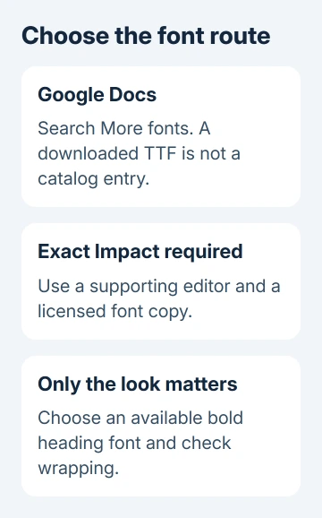
In the document, highlight the words whose font needs changing. Open the toolbar's Font list and look for More fonts. This adds choices from the font collection offered by Docs, rather than installing a file into ChromeOS.
The keyboard route also works on a Chromebook: press Alt+/, enter more fonts, then press Enter. Google's font-formatting instructions describe this search route.
Use the dialog's search field to look for the font you need. Select an available result, confirm with OK, then apply it to your selected text from the Font list. Check the document itself to see the change.
If Impact isn't returned, adding more unrelated fonts won't make it appear. The dialog searches its available collection. It isn't a file picker for a downloaded .ttf or .otf file sitting in Downloads.
Check your access to edit the file. A view-only file won't let you change text even when the font exists. Request editing access or make a copy if allowed; disabled formatting controls can mean an access problem rather than a missing font.
2. Use an available heading font when an exact match isn't needed
Choose a bold heading font that your editor actually offers. Start with a short sample of your real heading, then check its shape, spacing and line breaks. The font name doesn't show whether your finished title fits.
Turn on Bold if that font supports it, and adjust the size to suit the heading. A heavier weight changes the darkness of letters; a larger size changes how much room the words need. Those are separate controls.
Don't try to force a substitute into the same width by adding spaces between letters. That can look uneven when the document is opened or printed elsewhere. Choose a font and size that fit the actual text cleanly.
Check the whole heading, including numbers and punctuation. A substitute that looks close for one word can look quite different across a complete title. Keep the original file or a copy for a direct comparison afterward.
For a presentation, make the same decision inside the slide editor. The PowerPoint font guide explains why the fonts available to a desktop app differ from those in a browser editor.
This route is useful when you control the design. If a teacher, client or shared template specifically requires Impact, ask whether a substitute is acceptable rather than silently changing the typeface.
3. Use an editor that supports local fonts for an exact match
If Impact is required, check the chosen app's font-import support before getting a font file. Some editors can use local fonts; others only offer their own collection. Installing Linux doesn't automatically add a font to Google Docs.
For a Linux editor already installed on your Chromebook, use that editor's font instructions and a licensed Impact file. Set up the font inside Linux. Its fonts aren't shared with every Android app or Chrome tab.
A Chromebook can run a supported Linux environment without replacing ChromeOS. The Chromebook Linux guide explains that option, but a whole Linux installation is a large detour for one heading.
Another practical choice is to finish the exact-font version on a computer where Impact is already available in the editor you plan to use. Open the file there, select the heading and check that the actual font is being used.
Don't assume a font file is free to copy or redistribute just because Windows lists its name. Use a copy and workflow allowed by its license, especially for files supplied to clients or published as templates.
If the app's instructions don't mention custom fonts, ask its support team whether that feature exists on ChromeOS. Give the app name and version, the document format and the exact font name. That helps more than the Chromebook brand alone.
4. Preserve the appearance when sharing the finished work
An editable document can change appearance on a recipient's device if the needed font isn't available there. Before sending it, decide whether they need to edit the words or simply read and print the final design.
For a finished copy, use the editor's PDF export when available, then open the exported file and inspect the heading. Compare line breaks, clipped letters and page count with the source. Exporting is complete only when the file looks right.
When sharing an editable copy, tell the recipient that the document uses Impact. Agree on a supported font or editor if they can't display it. Knowing the font's filename won't help if their app can't import fonts.
If the exported copy still has the wrong letters, return to the editor where the correct typeface is available. A PDF export preserves what that editor produces; it can't turn a substituted heading back into the intended design.
The Short Version
Check the editor's font list first. Google Docs' More fonts adds catalog fonts, not downloaded font files. Use an available substitute for flexible designs, or a licensed Impact copy in a supporting editor when an exact match matters.
Checked November 12, 2026.